
Well, it’s that time again! Time to welcome back the fabulous applied colour psychology expert that is Karen Haller. Karen and I started our Colour Psychology column exactly two years ago to the day and I am happy to report that the posts are still as popular as they were when we started.
I know that colour is a pretty tricky thing to get right and many of us lack confidence when incorporating it into our own homes and interior design schemes. But hopefully, Karen’s insights into colour psychology can help us all gain a better understanding of how and why to choose colours and what combinations to use them in for best effect.
For this instalment we have opted to examine green interiors, and there are two reasons for this: Firstly, because I am loving green right now and secondly because green is the colour of the year for 2013, according to the Pantone Colour Institute. So without further ado, let’s hear what Karen has to teach us about the colour psychology of using green in interiors.

The Pantone Colour Institute recently declared Emerald Green as Colour of the Year for 2013. What was your reaction to this?
My honest reaction was one of relief. After the intensity and vibrancy of Tangerine Tango in 2012, there was really only one way to go and that was moving towards a hue that offers a sense of calm and serenity. It’s on the way to restoring some balance and harmony to the giddy year of the vivid Tangerine.
What are the main psychological properties of Emerald Green?
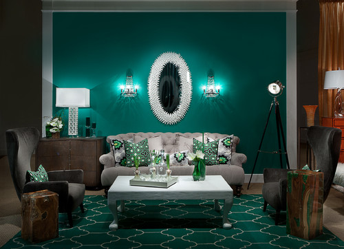
The main positive psychological properties green communicates are peace, balance and harmony. It can rejuvenate and restore, giving the feeling of being connected to nature and feeling safe and secure. Symbolically, emerald green communicates luxury and elegance as in the jewel.
How does this particular shade of green differ from other greens?
The more yellow in the green it communicates refreshing, new life, new beginnings. Emerald Green is a warm yellow-based green but one with depth to it which gives the quality of being more refined and elegant. It’s quite a rich colour.
How can we best harness the positive attributes of Emerald Green in our interior design schemes?
Firstly, ask yourself, does this particular tone resonate with you? Don’t just use it because it is a trend colour. If you don’t like it then choose a green that you do love and you can live with. Surround yourself with too much green or a tone that doesn’t resonate with your personality and you may feel the negative effects such as stagnation and you may find it drains you.

What other colours work particularly well in conjunction with Emerald Green and why?
You can go for the classic combinations of complementary colours such as red, which you can take into the pink tones, or you can go for a split complementary such as purple or orange. Go with any combination you like, the key is to use colours that are in the same tonal colour group (i.e. yellow or blue based) otherwise you are likely to experience a jarring effect making it difficult to live with over time. If you do decide to team with some red, just remember it will make the green look greener and the red redder. So if you are using purple it will bring out the red more prominently.
Likewise, which colours should not be used in conjunction with Emerald Green?
Traditionally in the design world you are taught not to put blue and green together. But I think you can, it all depends on tone of green and blue you use. My advice would be the same as above use the same tonal colour group as the green you are using and you can experiment with the most unexpected and effective colour combinations.
 45 litre Touch Bin")
Brabantia Emerald Green (RAL 6001) 45 litre Touch Bin
What are your top tips for using Emerald Green successfully in residential interiors?
Always use colour with purpose. Look at the mood, the atmosphere you want to create. Decide whether emerald or any other green is right for that space. Decide on the combination, proportion, placement for all the colours being used. Remember that each tone of colour has its own set of psychological properties which can change depending on what other colours you team with it, sometimes even bringing out quite negative traits.
Are there any rooms in the house that particularly lend themselves to Emerald Green? Why is this?
Any room in which you would like to create an atmosphere of luxury, refinement or elegance. You may like to create a statement in the entry foyer, or in a formal dining area. If you have a library or a reading nook green is a good colour to use if you wish to cocoon yourself away in, giving the feeling of being safe and secure.
Be aware if you are using greens with blue undertones in a room that receives little natural light it may make the room feel even colder.
In fact, green does work anywhere, just by bringing plants into the home you bring in positive life energy and reconnect with nature which is so important for city dwellers.

Bisazza mosaic collection 2013 Shift l’Elba
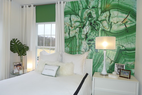
Pantone have recently partnered with JCPenny to launch a range of Emerald Green bedding products. How does green affect us when used in the bedroom?
Given green’s positive psychological qualities and the emerald tone, makes it a good choice for bedding – as an accent colour. Word of caution here is to steer away from any lime greens as yellow is the colour to avoid in the bedroom.
Green is often associated with growth, renewal, prosperity and regeneration. Do you think that this choice of colour is indicative of our hopes for a more successful year in 2013?
Green representing growth, renewal, prosperity and regeneration would seem to be the ideal colour to surround ourselves with. It’s no coincidence the majority of urban/city dwellers escape to the country on weekends and on holidays – it’s to reconnect with nature, take in the green on a subconscious level to restore, and rejuvenate.

Once again my thanks go out to Karen for her insightful and educational contribution to the colour psychology series and for providing her insights into green interiors.
Further Reading?

Green is nature’s whisper indoors! The calming effect it brings to a space is truly remarkable. I find myself instantly relaxed in rooms adorned with lush greenery or soft green hues. It’s like inviting a piece of the serene outdoors in.
Green is a classic color choice and a great way to add a sense of comfort to your space which you’ll appreciate it for years to come.I love green and white interiors!
Hi Karen first of all, great post, i’m not one to argue with your psychological expertise, however ive been involved in Property and interior design for a few years and have struggled with the colour green. I found your Orange Interiors post a lot more welcoming and aesthetic, I try my best to be in sync with nature and have a holistic health approach! i understand what you are doing with the colours here and don’t get me wrong i think the designs are fantastic, however i find these greens uneasy due to how bold and stand out they are, still a great post.
Alex
Very interesting read!!! We love the idea of going bold with green this season! Take a look at a similar post we did on our blog :)
http://benedictaugust.com/blog/color-story-emerald-green/
Thanks for sharing – great images on your blog post too! Karen :)
I’m bookmarking this post – so great! I’m actually thinking of being very brave and getting an emerald green velvet sofa for my living room;-)
Hi Igor, looking forward to you posting the image of your emerald green velvet sofa – a chaise lounge would be very luxurious….
Hi girls, thank you for an interesting read.
I love Emerald Green but have not used it in my own home as I have windows everywhere and lots of light coming in..
It is a beautiful colour and I can see many uses for it. Only today I had a meeting with someone who produces stationery and I alerted him towards an Emerald Green shade.
Thanks Tina, great that you are recommending Emerald, it’s one of my favourite colours right now and I personally love being surrounded by green at home.
You’re welcome Tina,
Glad you found it interesting. I’m curious as to why you couldn’t use it in a home that has lots of natural light? Love to know your thoughts. Karen :)
I love bold colors like this! In Stockholm I visited a kids workshop in this particular green color and it felt great: http://www.joelix.com/Pantone-Emerald-or-Saint-Patricks
Thanks Judith for your comment. I just popped over to your blog and commented on your post :-)
Hi Judith, Thanks for sharing the link. It would be interesting to see the effect of so much of one dominate colour will have on the children over time.
I really like this post. Lots of tips and practical advice, thank you! I was rather surprised with her remark about combining blue and green since that was a huge trend at the Dutch furniture show for 2013.
When I was still a student I had my flat all white with burgundy red and emerald green accessories. I always loved that green hue. I recently tried to add a few green accessories in my current home, but found out that my home is just too dark to pull it of nicely. It makes it even darker. So unfortunately I can’t participate in this trend.
Hi Louise,
Glad you enjoyed reading the article and thanks for the information on the Dutch furniture show.
If emerald isn’t working for you, you could always try a lighter tone of green, one that has more yellow in it. Karen :)
not a fan of this colour for the home(well my bedroom)
Hi Corve, That is the beauty of personal colour preferences, know what you like and don’t be swayed by trends. Do you have a favourite colour for your home?
I do like green and have used it previously as an accent in my interior. Interestingly I felt it wasn’t right for me after living with it for a while. I particularly favour the combination of green with a darker wood, for example in this hotel space in Mexico http://pinterest.com/pin/97179304431633973/ It has a much more calming effect. I would tend to avoid an energising green for my interior space.
Thanks Karen & Stacey. Genuinely insightful post! x
Great to hear from you Gerard, colour is a very personal choice as you well know ;) If you try and you don’t like it or it just doesn’t feel right, then change it.The darker the green the more calming, relaxing. Energising green (lots of yellow) needs to be in the right space to work well. Probably best as an accent colour. I once saw it painted in a gym – can you image exercising surrounded by that colour – whoa! ;)
Hi Polly,
Using a colour in your accessories is a great way to introduce a colour into your home, especially if it’s a deep, strong colour such as the Pantone Emerald Green.
Enjoy, Karen :)
Wow that’s a pretty bold colour. I think I’d stick with emerald green accessories. I like white and bold green together for a really fresh look.