
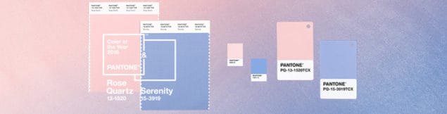
Every year since 2000, the Pantone Color Institute, the global authority on colour, has announced its colour of the year. In order to decide which colour will represent the given year, the colour experts comb the world looking for the colour influences which best define the global zeitgeist. They look to the worlds of entertainment, film, travel, the arts, economics, fashion, jewelry, technology, industrial design, sports and politics. Back in 2011, I interviewed Leatrice Eiseman, the Executive Director of the Pantone Color Institute and one of those tasked with the job of determining the colour of the year and she told me how they go about deciding it. You can read the interview with Leatrice Eiseman here. This year, for the first time ever, Pantone has selected the blending of two shades as Pantone colour of the year 2016 : Rose Quartz and Serenity.

According to Pantone, “Rose Quartz is a persuasive yet gentle tone that conveys compassion and a sense of composure. Serenity is weightless and airy, like the expanse of the blue sky above us, bringing feelings of respite and relaxation even in turbulent times.” The experts believe that consumers are looking to deal with modern day stresses by seeking mindfulness and well-being and for that reason we are leaning towards colours that offer us reassurance and security.
 The colour choice has inevitably provoked a lot of debate but I actually quite like it and I do find both of these shades to be quite soothing and reassuring. Luckily there are plenty of products already on the market that make decorating with these colours a straightforward process. The easiest and cheapest way to incorporate colour trends into your own home is to opt for smaller objects and accessories that can easily be replaced should you change your mind down the line. I have put together a series of moodboards featuring products for the four main rooms of the home: Livingroom, Bedroom, Bathroom and Kitchen.
Livingroom

1 | 2 | 3 | 4 | 5 | 6 | 7 | 8 | 9 | 10 | 11 | 12 | 13
Bedroom

1 | 2 | 3 | 4 | 5 | 6 | 7 | 8 | 9 | 10 | 11
Bathroom

Kitchen

1 | 2 | 3 | 4 | 5 | 6 | 7 | 8 | 9 | 10 | 11 | 12 | 13 | 14 | 15 | 16 | 17
So what do you think of the Pantone colour(s) of the year for 2016? Will you be using these two shades in your home next year?
nice color but for me, panton color is not a like this. blue & pink light shades are good for some of the things not all.
Not only I’m into muted tones, but also this is my all time favourite colour combination! It gives a retro feeling too. Gorgeous :)
The Pantone Colours are not my type If I have to be honest, but still. The blue one is kind of prettier :) Waiting for the next trends.
Hmmm blue & pink light shades are good for some of things not all. This color doesnt suits to many of them but thanks for drawing about the things into this colors.
Thanks so much for the feature, Stacey!
For someone like me… (not much of a pink color lover) I can’t imagine even half of those for my home decor. Yes, they look nice but certainly not my cup of tea. Way bigger fan of their 2015 choice for color of the year.
Obviously these colours aren’t for everyone and this choice has been quite divisive. I love following trends but when decorating your own home it’s important not to follow trends just to be trendy, you need to love the space you create so you’re much better off choosing colours and pieces that resonate with you, even of they were last year’s trend.
Love your choices Stacey, but for me, Pantone’s colour choices are not filling me with design inspiration :( I like the smokier end of Serenity, like your geo rug and sheepskin rug. I could certainly live with those!!