Welcome to my kitchen makeover final reveal. I cannot tell you how happy I am to publish this post today. It’s been such a long time coming. We started this kitchen makeover a year ago and it is finally finished. I honestly couldn’t be happier. It’s such a relief to have a kitchen that I am proud of, and I no longer need to be embarrassed when guests come round. You can read about our kitchen makeover plans here and you can see the project in progress here.
I’d love to show you around so you can see just how far we’ve come. When we moved in, in 2013, the kitchen was dark and drab and really lacked storage space. I won’t go into too much detail about why I hated the kitchen as I’ve covered that in past posts. I’d rather focus on the positive change we have managed to create here.
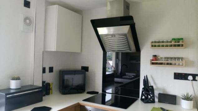
We got rid of the black laminate worktop and replaced it with white laminate from IKEA. This has really helped to brighten the space and bounce light around the room. I chose this worktop as I really liked the wood effect trim. I realised, when looking at my kitchen inspiration board on Pinterest, that I really like kitchens that mix white and wood. The trim on this worktop actually matches the units that we already had. I was considering painting the cabinets but once the worktop was in situ I really liked how it worked with the cabinets so we’ve decided against painting them.
We mounted a couple of IKEA spice racks on the wall next to the hob. My husband loves to cook and always uses a varied selection of herbs and spices, so we added these shelves so he can keep them close to hand and can see what he has at a glance.
We also replaced our old electric hob with this lovely induction hob. It is so much easier to keep clean and has lots of useful functions. My husband is a fantastic cook but a very messy one and as I don’t do the cooking, it’s down to me to clean up the mess. So I was really keen to get a glass splashback that would be easier to clean and would protect our gorgeous new tiles, which are from the Function and Form range by British Ceramic Tile.
When I spotted this overhead extractor, which came with a glass splashback I knew it would be perfect for our makeover. I think it complements the induction hob really nicely. We also vented the extractor outside which has really helped with humidity levels at home.
One thing my husband always complains about is knives. He’s very particular about the knives he uses and if they are not sharp enough and don’t cut well it makes him really angry. When we knew we were going for a monochrome and geometric theme in the kitchen I knew straight away where we could get some new knives from. I loved this knife block and knives from Edge of Belgravia as soon as I saw them. In fact, I wanted to reach out and ask if I could have a set to review at the time.
However, with my kitchen in such a poor state, I had nowhere appropriate to photograph them. So I wasted no time in getting in touch to see if Edge of Belgravia would send me a set for my new kitchen. They look amazing don’t you think? The knife block is almost more like a sculpture.
We’ve had lots of comments about it when friends visit as it provides a great focal point on the work surface. The knife block is also made from a really nice matt material. We have four knives in our set (there are additional holes in the block to add more knives) and they have surpassed my husband’s high expectations.
What he likes most about them is the shape of the handle, that little arc between the handle and the blade. He said it makes cutting really stable and comfortable. I was relieved he liked them as he thinks I’m prone to choosing style over substance when it comes to things like this.
We like to listen to music in the kitchen and my husband will often listen to documentaries or watch films while he’s cooking. So we use our Bowers & Wilkins T7 wireless speaker in the kitchen for this purpose. The honeycombe pattern that surrounds the speaker grill reflects the subtle hexagonal pattern on the wall tiles. They look great together, don’t you agree?
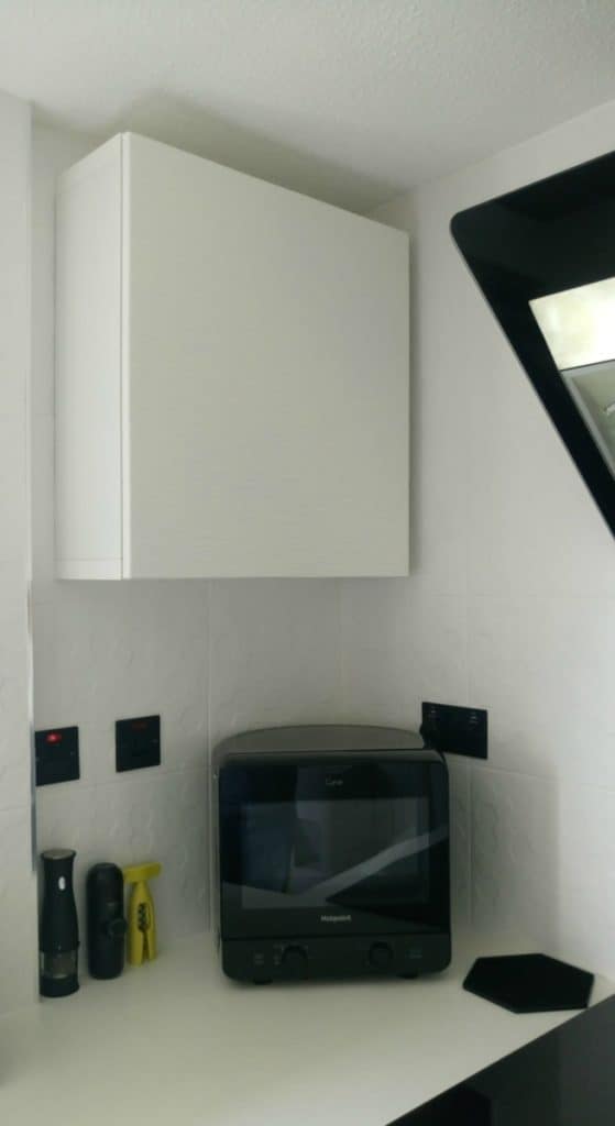
As we finished the makeover, I was debating whether or not to get rid of the microwave and free up some extra work surface, but we do actually use it a fair bit. So instead of getting rid of it altogether, I started to search for a more compact one that would take up less space. I eventually decided on this little number from Hotpoint which looks more like a portable TV than a microwave. It has a curved back so it fits neatly into the corner. We’ve had a mixed response to the microwave, mostly due to the shape, but I really love it and it is perfect for this space.
We added a shallow cupboard (from IKEA) in the corner above the microwave to store more of my husband’s cooking ingredients. This was formally a wasted space and we had temporarily put up open shelving here which looked absolutely awful and so messy. Now all our ingredients are nicely stored away and easily accessible.
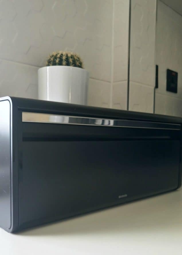
I also wanted to get a new bread bin. We had a lovely one that had a lid that doubles up as a chopping board, but I found it quite impractical. We tended to put stuff that we use on a daily basis on top of the lid and then forget what we had put inside.
Instead, I wanted a fall front bread bin that would allow us to easily see everything inside. I headed straight over to the Brabantia website as they are my go-to brand when it comes to good quality homewares, especially for the kitchen. I found this matt black bread bin and knew this was exactly perfect for our new kitchen. Whilst it is smaller than our old bread bin, we have no problem storing everything we need in it, probably as it’s not full of food that has been forgotten and gone out of date.
Last year, when we started this makeover, we replaced our old kitchen sink with this black granite one. I really like the fact that it has two half draining boards, one on each side. It works really well with our Joseph Joseph washing up bowl and draining rack. You can read my review of these items here.
What does annoy me though is the alignment of the sink, as it is not directly in front of the window. However, due to the layout of the kitchen cabinets, it was not possible to get it central without reconfiguring the base cabinets, which I just didn’t fancy doing. It’s a minor annoyance and I wish it was different, but it didn’t bother me enough to go through all of the hassle involved in changing it. We may as well have gotten an entirely new kitchen instead!
As I mentioned in a previous post, we decided to move the kitchen cabinets right up to the ceiling. This allowed us to add an open shelf (from IKEA) below.
I decided to use this shelf for the crockery and glassware that we use on a daily basis. This gives us easy access to these pieces and also means that nothing on the shelf ever gets greasy or dusty as we use it and wash it every day. I was worried it might look a bit messy and cluttered but because everything is either white or glass, I think it looks quite neat.
In the image below you can see the super stylish matt black electrical sockets we opted for. I’m afraid I’m not sure where they are from as our electrician sourced and fitted them for us. But they do look really smart against the white tiles.
Our Avvolta kettle and toaster from De’Longhi fit in perfectly here. You can read my review of these items here. I really enjoy using this kettle and toaster, and even more so now that the kitchen is finished. The horizontal layered bands that wrap around the appliances in an asymmetric spiral fit the geometric theme very nicely.
I also decided it was time to get some new storage jars for our tea, coffee and sugar. I found these amazing geometric matt black ones over at Mia Fleur and the lovely team there were more than happy to send me over a set for the new kitchen. What I like about them, apart from how gorgeous they are, is the size. There are three different sized canisters and they each come with a wooden lid, which has a really good seal. They look great on this monochrome tray from Marimekko.
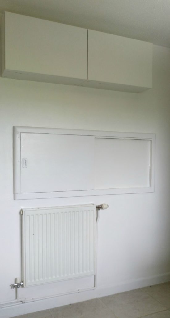
Over on the other side of the kitchen, we have painted the wall white (it was magnolia) and added some extra storage up above the serving hatch. This has provided us with some much needed extra food storage space.
What I still want to do though is remove that radiator that we never use and get a kitchen trolley that we can place below the hatch. This would provide us with a little extra surface space and somewhere to store our vegetables, which are currently homeless. Hopefully, that will happen later this year.
We also need to get a new light fitting for the ceiling. I’m also in two minds what to do about the flooring. The current tiles are so badly laid, but taking them up would be a massive, messy job, which I’m not sure I can face yet.
For the moment I’ve bought a couple of monochrome indoor/outdoor rugs from Wayfair to cover the majority of the floor. This helps a lot but is obviously not a long-term solution. Maybe I’ll be able to face the floor next year. But once that is done, this room will be totally finished.
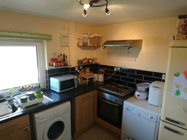
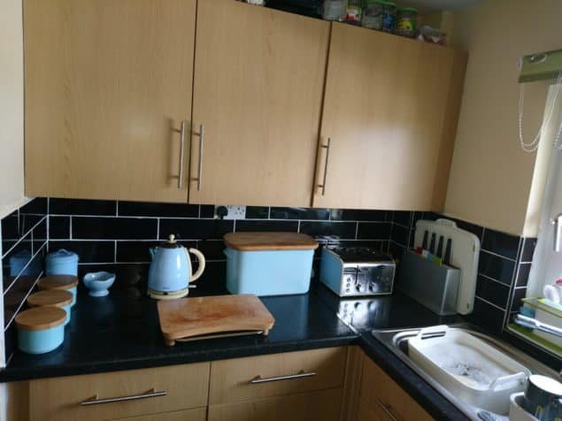
If you need a reminder as to what this space looked like before, here are a couple of images.
Heaps better right? The tiles we have chosen from British Ceramic Tile have really transformed this space. I’m so glad that I decided to use them again. (You can see how we used the same tiles in our bathroom here).
They are without a doubt the defining element of this kitchen makeover. They have brightened up the space so much and I love the fact that the subtle pattern is so understated. And the large size of the tiles means there are fewer grout lines and I’m convinced that this makes the space seem larger.
Let me know what you think of our kitchen makeover. I’d love to hear your feedback! I’m off now to get stuck into our garden makeover planning. I’ll be writing all about that here soon too.
Disclosure: This post has been written in collaboration with a number of brands who I approached and who have kindly agreed to sponsor my kitchen makeover. I would like to thank British Ceramic Tile who have provided the tiles, Edge of Belgravia who supplied the knife block and knives, Brabantia who supplied the bread bin and Mia Fleur who kindly sent me the storage jars. As usual, all the opinions in this post are my own and I stress that I only collaborate with brands and companies that I genuinely like and believe that my readers will like too.






What a transformation! Very neat and clean. I’m sure it went beyond your expectations.
Thank you Jeffrey, it really did exceed our expectations!
unique and stunning concepts.hope to upgrade my kitchen.i think this will help me to gets an idea.thanks for sharing with us
What a difference! You must be so pleased with how it’s turned out, thanks again for including us in the post – pleased to be a part of it!
What a difference changing the worktops made! You must be chuffed to bits with your kitchen now. The black and white scheme works really well with the wood units. And I really love the microwave. x
Ahh Stacey, I’m so happy that you’ve finally got the kitchen you wanted – it looks lovely and filled with some really nice pieces too. I have the same Brabantia bread bin (but in white) and that knife set is beautiful indeed! x
Looks wonderful Stacey. It must be so nice going in there every day. Looks light and bright. x
Looks fab! You should be proud of it now. I love the detailing in the tiles, and the little shelf under the units.
That handy little shelf is such a cool idea (can I steal that please?)
Haha, go ahead. It’s really very practical.
That shelf under your cabinets is a genius idea!! Go you! Bet you are so pleased
I can’t even describe how happy it makes me!
Yay! Well done you. Looks so much better. The worktop was a great choice with the cupboard fronts. And moving the wall cabinets up to allow for open storage underneath was a fab idea.
I’m so proud I had the idea to move the cupboards up. Granted I can’t reach the top shelves now, but I don’t cook anyway lol!
How fabulous! I can see why you’re so happy with it x
Thanks Lucy! I love it!
WOW! Stunning! What a great job! I love it so much!
Ah thanks Gabrielle!